


Happy Fall! The leaves are turning, the rain jackets are back out, and the third quarter is officially in the books!
Every quarter, we dig through a stack of research from our favorite investment partners, including Capital Group, J.P. Morgan, Morningstar, State Street, and Avantis. Much of it is genuinely fascinating (at least to us), but very little of it makes the headlines. And with so much financial news coming at you from every direction, it can be hard to separate the good information from the bad. Helping you sort through it is a big part of our job.
So we’ve pulled together a few of our favorite charts from this quarter’s research. Rather than add more predictions to the pile of noise, we’ll let the data do the heavy lifting here. Together, these charts show what’s driving stocks, what’s happening with bonds and interest rates, and a couple of trends we’re watching closely within the economy and financial markets.
Stocks
1. Stocks have climbed while bonds have slipped
We'll start with the big picture. This chart tracks the year-to-date total return of U.S. stocks, international stocks, and U.S. bonds through October 8.
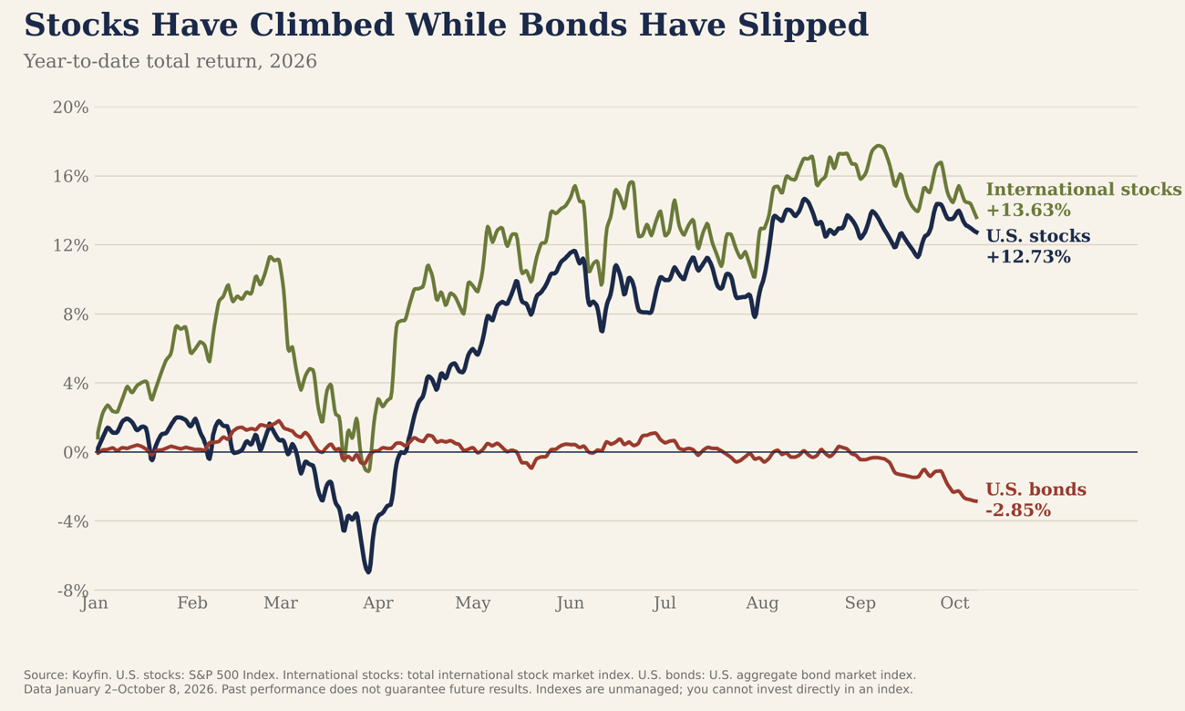
It has been a year of alarming headlines: an oil shock driven from a U.S. conflict, the Fed's first rate hike in three years, and a sharp spring sell-off that had the S&P 500 down about 7% by late March. Yet both U.S. and international stocks are up roughly 13% for the year. International stocks have kept pace with U.S. stocks and are slightly ahead, a trend that has persisted in recent years. Bonds are a different story, down about 3%, and we'll come back to why in a bit.
2. Global companies are growing revenue fastest
While stock prices are impacted by headlines and sentiment in the short-term, over the long-term stock returns are driven by corporate earnings. And those earnings start with revenue. This FactSet data reviews the year-over-year revenue growth for the second quarter for S&P 500 companies, based on where they generate a majority of their revenue globally.
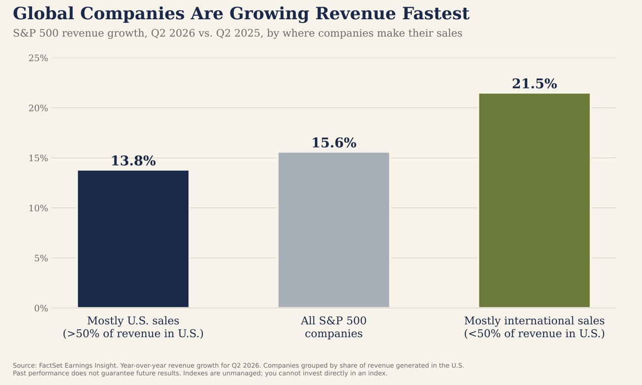
Revenue across the S&P 500 grew 15.6% from a year earlier, more than double the roughly 6% average of the past decade. Companies doing most of their business abroad grew even faster, at 21.5%. That strength helps explain why international markets have done well this year. This revenue growth has trickled down to the bottom line, with expanded profits for stock investors.
3. Most stocks have quietly pulled back
While it has been another strong year for the stock market, under the surface, September was a tough month for many stocks. This chart shows the share of S&P 500 stocks trading above their 50-day moving average (2 calendar months), a common gauge of how many stocks are participating in the market's gains.
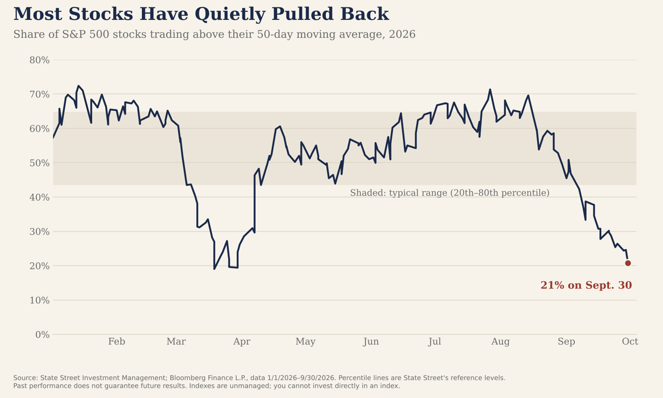
By September 30, only 21% of stocks were above that line, about where things stood at the bottom of the spring sell-off. In other words, the index held near record highs while many individual stocks pulled back. This isn't a reason to panic; as the spring showed, breadth can turn around quickly. But it tells us the market is more fragile than the headline index suggests. A small number of tech stocks performing well has buoyed the overall index.
4. Pullbacks are a normal part of investing
When the market feels shaky, it helps to remember how often it gets shaky. Each bar shows the largest peak-to-trough decline for U.S. stocks within that calendar year, going back to 1985.
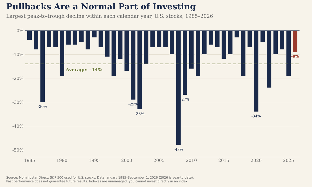
The average year has included a drop of about 14% at some point, including many years that finished with strong gains. Through September 1, 2026's largest decline was about 9%, a more mild year than average. Declines like these are the normal cost of owning stocks, and riding them out is how investors have historically earned stocks' long-term returns.
5. Midterm years: choppy start, strong finish
With midterm elections next month, it’s common for the media to merge politics and financial markets. Capital Group looked at S&P 500 returns in every midterm year since 1931 and compared them with all other years.
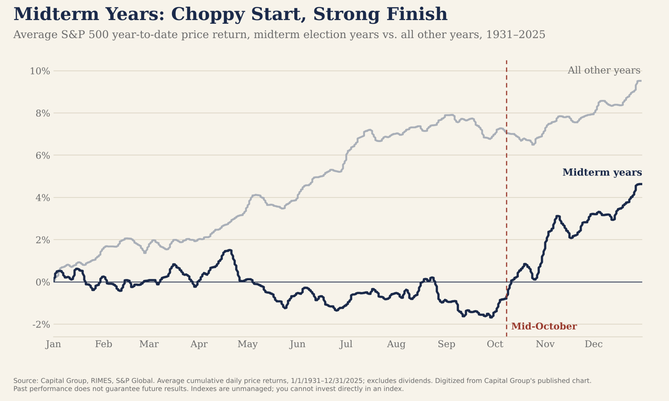
On average, midterm years have been flat to slightly negative through early fall, with volatility rising as the election approaches. Once the uncertainty clears, stocks have historically rallied into year-end. Mid-October is right about where that turn has typically happened. History won't necessarily repeat, and we would never position a portfolio around an election, but political noise tends to fade faster than most people expect.
Bonds and interest rates
6. The 10-year Treasury yield is back above 5%
The 10-year Treasury yield is one of the most important numbers in finance. It influences mortgage rates, corporate borrowing costs, and how investors value nearly every other asset. This chart shows it going back to 1996, a 30 year history.
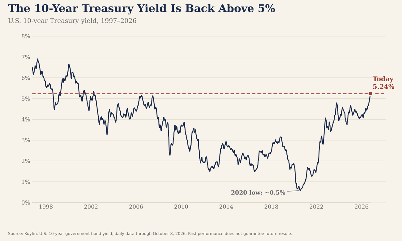
At 5.24%, the 10-year yield is at its highest level since 2002 and a far cry from its 2020 low of about 0.5%. Several forces pushed it up this year: the Fed's September rate hike, energy-driven inflation, heavy government borrowing, and strong demand for capital tied to AI investment. Higher rates are a headwind for mortgages and bond prices. The common 30-year mortgage rate is primarily benchmarked off the 1o-year treasury yield. As the next few charts show, from conservative investors they also create real opportunity.
7. Bonds have been a headwind in 2026
Bond math says that when interest rates rise, bond prices will fall. This chart shows year-to-date total returns across the major parts of the bond market through September 30.
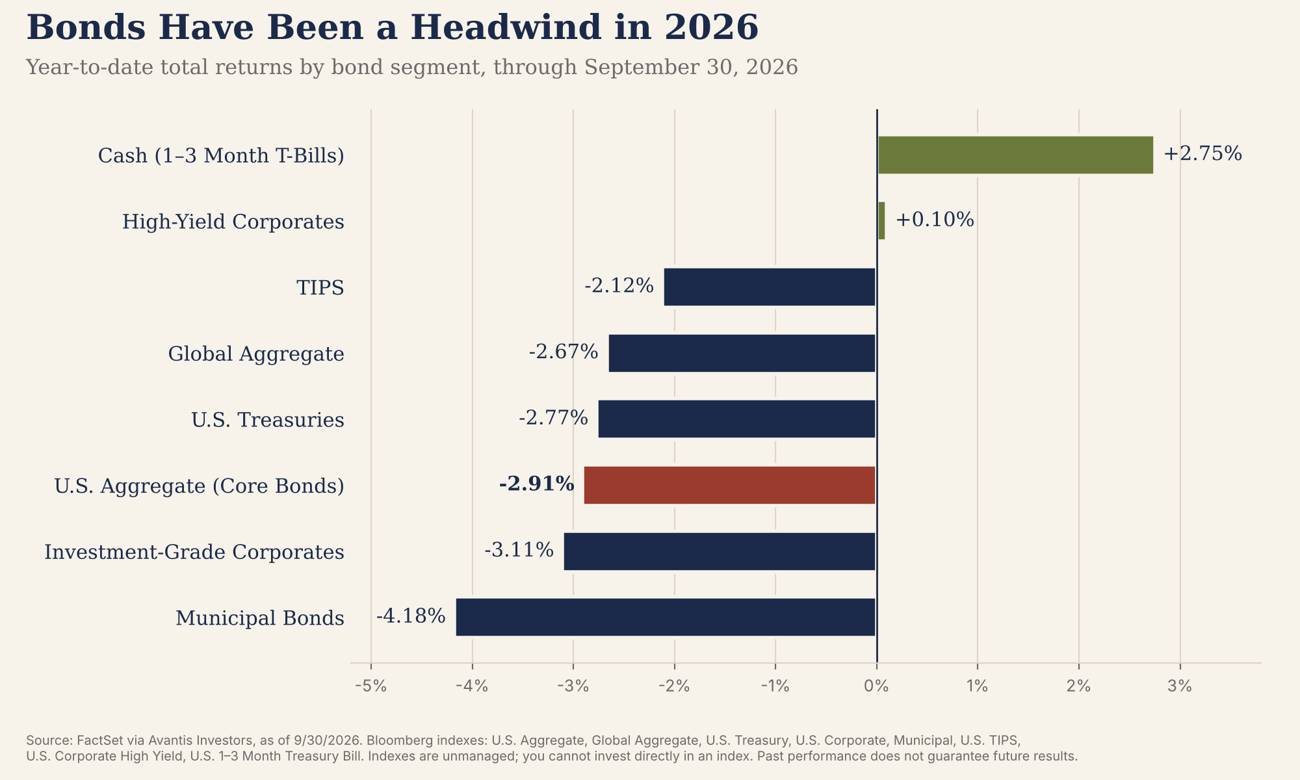
Most bond categories are down 2% to 4% this year, with core bonds (the Bloomberg U.S. Aggregate Index) at –2.91%. Municipal bonds have had the toughest stretch, down 4.18%, given the longer-term nature of these bonds. Short-term Treasury bills, which barely react to rate changes, are up 2.75%. When interest rates rise, long-term bond prices are impacted more than short-term bond prices. Think of a teeter totter, the longer the board, the bigger the swings. The same idea for bond durations: a 30-year bond is substantially more impacted by interest rate changes in the market than a 3-year bond is. A down year for bonds is uncomfortable, especially when stocks are up, but it sets up what comes next.
8. Bond math: income +/- price change
To understand what's happening in a bond portfolio, it helps to split the return into two parts: the interest income bonds pay, and the change in the bond price. This chart does that for the U.S. investment-grade bond market (core bonds) over the past 12 months.
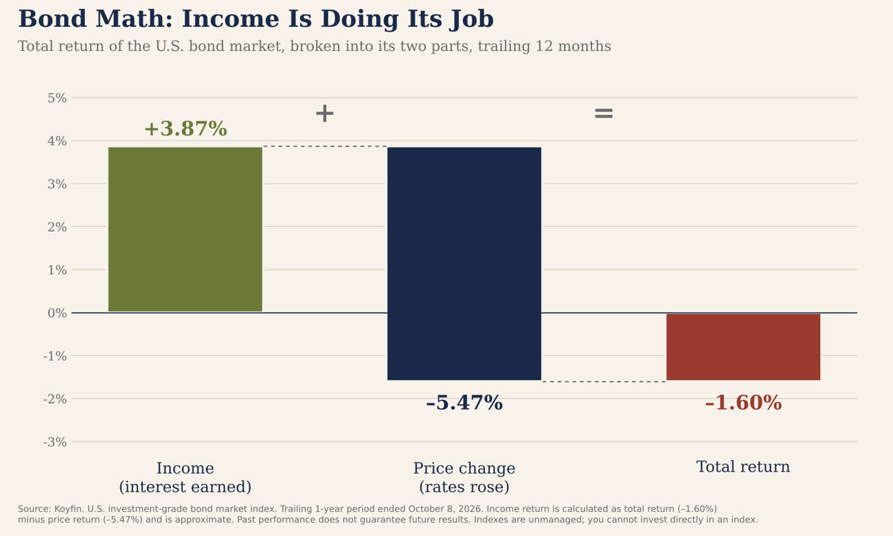
If you bought the bond index 1 year ago, these bonds paid about 3.9% in income, while rising rates knocked about 5.5% off their prices, for a total return of –1.6%. Here's the key: the income is permanent, while price declines on bonds held to maturity will unwind as they approach their full-face value at maturity. And because rates are now higher, the income going forward is higher too. Every month, bond portfolios reinvest maturing bonds and interest at today's more attractive yields. So while painful to experience, bonds continue to pay healthy income, while the opportunity set going forward gets more attractive with higher rates.
9. Higher starting yields have meant higher bond returns
So what do higher rates mean for the years ahead? Morningstar grouped every month since 1978 by the starting 10-year Treasury yield, then measured what core bonds returned over the following seven years.
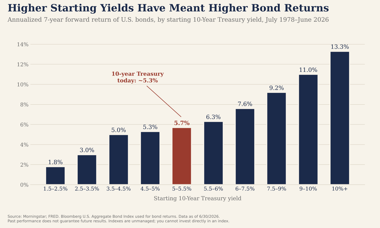
The pattern is remarkably consistent: the higher the starting yield, the higher the return that followed. And that is a big reason investors like bonds, you can map out expected future returns with high certainty. When the 10-year started between 5% and 5.5%, roughly where it is today, core bonds went on to return about 5.7% per year over the next seven years. Compare that with the 1.8% that followed when yields started near 2%, as they did for much of the last decade. For investors who have been sitting in cash waiting for certainty, bond yields today are among the most attractive in more than two decades.
Other things we're watching
10. Big IPOs have often stumbled in year one
Some of the most talked-about private companies in the world, including OpenAI and Anthropic are exploring public offerings after the recent mega-IPO from SpaceX. This chart shows how the 20 largest IPOs since 2010 fared in their first year of trading.
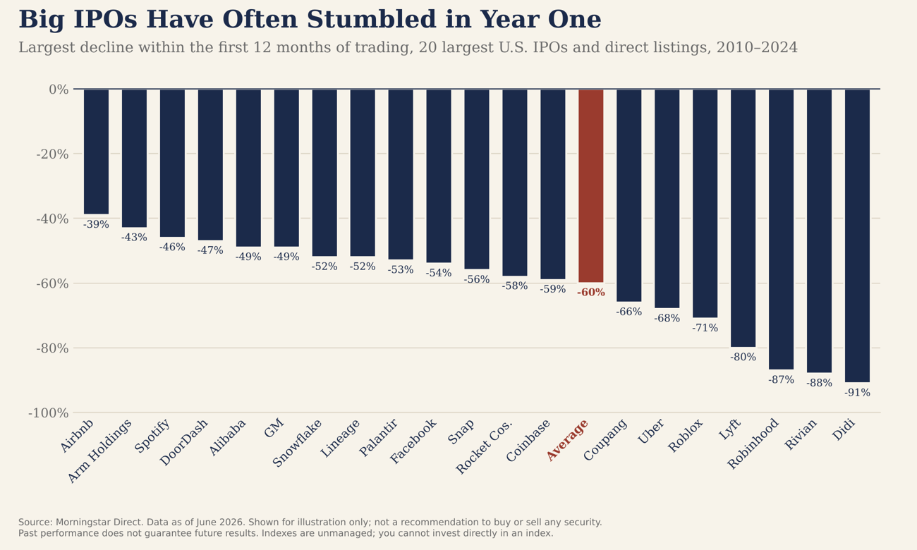
On average, these companies fell 60% from their peak at some point in their first 12 months. Even household names like Facebook and Uber dropped more than 50%. That doesn't make them bad businesses, several are now among the largest companies in the market. But the excitement around a hot IPO often runs ahead of the fundamentals, so if one of these offerings catches your eye, it’s generally advantageous to have some patience rather than rushing in at any price.
11. AI spending by the largest tech companies keeps climbing
One of the biggest forces behind corporate growth is the race to build out artificial intelligence. This J.P. Morgan chart shows how much the five largest AI “hyperscalers” (Alphabet, Amazon, Meta, Microsoft, and Oracle) spend each year on data centers, chips, and other infrastructure.
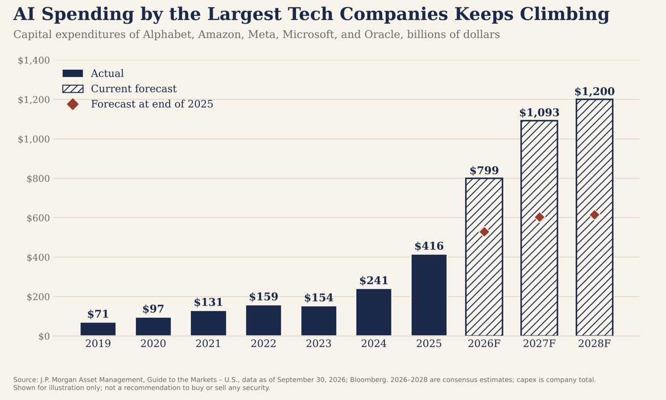
These five companies spent $416 billion in 2025, and analysts expect that to nearly double to $799 billion this year and reach $1.2 trillion by 2028. Just as striking, forecasts at the end of last year called for about $530 billion in 2026, so expectations have jumped roughly 50% in nine months. So this remains a rapidly evolving landscape for an unprecedented level of corporate expenditure. That spending becomes revenue for the companies supplying chips, power, and construction, which helps explain the strong revenue growth we highlighted earlier. The big question, and one we're watching closely, is if and when this substantial investment pays off.
12. Inflation has cooled from its peak, but remains above target
Inflation is the number that drives interest rates, and it's back in the headlines. This chart shows headline inflation, the year-over-year change in the Consumer Price Index, since 2018.
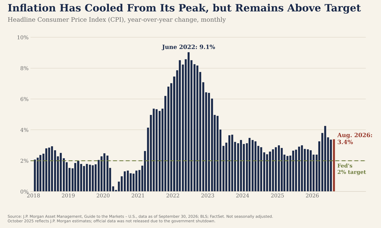
Inflation peaked at 9.1% in June 2022 and has come down substantially since. But it has stayed above the Fed's 2% target for more than five years, and it jumped back to 4.2% in May as oil prices spiked. At 3.4% in August, stubborn inflation is the main reason the Fed raised rates in September for the first time in three years.
13. Oil through the Strait of Hormuz has nearly stopped
Next, a chart that explains much of what you've felt at the gas pump. It compares crude oil shipments through the Strait of Hormuz in 2026 with the same days last year.
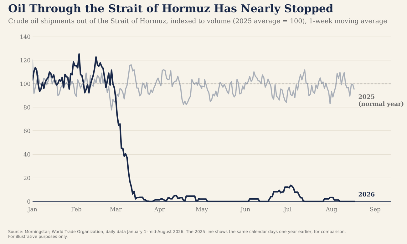
Since early March, shipments through the strait have fallen to nearly zero amid the conflict in the region, pushing Brent crude back above $100 a barrel. That takes a meaningful share of the world's oil supply offline, and the effects ripple through gas prices, inflation, and interest rates globally. When the strait reopens is one of the biggest swing factors for markets at the moment.
14. Gas prices have jumped back toward 2022 levels
Finally, here's how that shows up for households. This chart tracks the weekly national average price of gasoline this year, compared with 2025 and with 2022, the last gas price big spike in the U.S..
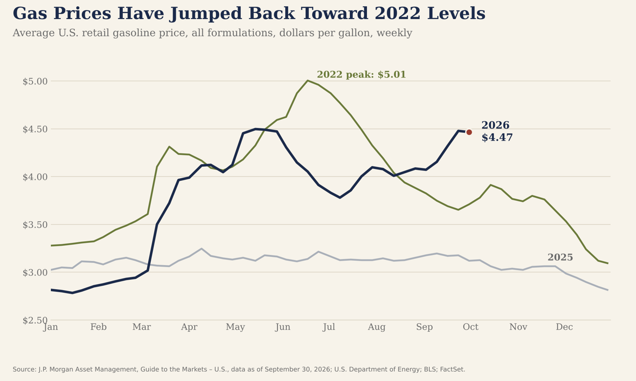
Gas started 2026 at about $2.81 a gallon, below where it was a year earlier. By late September it was $4.47, up nearly 60% and not far from the 2022 peak of about $5. Higher gas prices squeeze household budgets and feed directly into the inflation numbers the Fed watches. Economists generally view supply-driven spikes like this one as easier to resolve than inflation from an overheating economy, which is why the strait's reopening matters so much.
The bottom line
Put it all together, and the story of 2026 is better than many of the headlines suggest. Companies are growing revenue at a healthy clip, international markets are pulling their weight, and bonds are paying their highest yields in more than two decades. The risks are still real however: higher rates, spiking energy prices, and a market that has narrowed under the surface. We're watching all of them closely, and none of them change what drives a sound investment plan: staying diversified, staying invested, and giving your 3-buckets the proper time to work.
If you have questions about any of these charts or what they mean for your portfolio or financial plan, don’t hesitate to reach out. We're always happy to talk it through!
The Mirus Planning Team
Sources: Capital Group; J.P. Morgan Asset Management, Guide to the Markets – U.S. (data as of September 30, 2026); Morningstar, Signal & Noise (September 2026); State Street Investment Management, Chart Pack (October 2026); Avantis Investors, Monthly Field Guide (October 2026); FactSet, Earnings Insight; Koyfin; Clearnomics via Kitces.com, “7 Charts for Client Conversations in Q4 2026”; Osaic Research, Market View Monthly (September 2026). Data as of the dates noted on each chart.
This material is for informational and educational purposes only and is not a recommendation to buy or sell any security. Past performance does not guarantee future results. Indexes are unmanaged, and you cannot invest directly in an index. All investing involves risk, including the possible loss of principal.